So right off the bat, Cities XXL is not substantially different from its predecessor (Cities XL). In my time with the game so far, I've only encountered two new features. Everything else, right down to the buildings available and the game interface, are unchanged. XXL hardly deserves to be called a sequel or sold as a new game. It's a content patch, and not even a very good one.
But on the upside, since I never got around to reviewing the original Cities XL, I can just roll them both into one review!


This review will cover both Cities XL, and Cities XXL because they're practically the same game.
When I first started playing Cities XL a few years ago, I was really impressed with it. I hadn't really played any modern city-builder games since SimCity 4, and so the jump to 3-D graphics, the ability to draw curved roads, and the sheer size of the maps was enough to win me over initially. But as I've played the game more, it's limitations and weaknesses have become much more apparent and hard to ignore. This is especially true in the game's interface and controls, which are very rough and full of nagging annoyances. When compared to the much smoother and organic controls of games like Tropico 5, the modern [disastrous] SimCity reboot, and even older games like Caesar IV, Cities XL really starts to look bad.
The biggest deterrent to enjoying Cities XL is its UI and controls. There's nothing that really single-handedly breaks the game, but there's a cacaphony of small, nagging problems that gradually wear down your resolve to play the game. The first thing that you'll notice is the ugly and disorganized interface. There are buttons and widgets floating all over the screen: build icons, overlay toggles, camera control widgets, zoning sub-controls, and so on. You can customize some of the UI elements by dragging them to different places on the screen, but there is no arrangement that really feels comfortable.
Charts, graphs, and table widgets are also ugly and difficult to read or understand, so I rarely use them. There's a lot of depth of information in these widgets, but they are just so poorly designed as to be nearly un-useable. And while some info-widgets show a great degree of granularity and precision, others are oddly abstracted. For example, shops and industrial buildings say that they require a "medium" number of workers of various classes, but they don't specify exactly how many employees they require. I assume that "low", "medium", and "high" correspond to the respective sizes of the residential zones, but I don't know for sure.

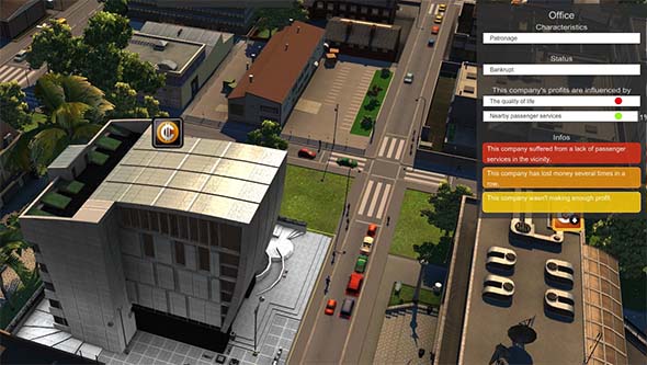
This office building had to close before I found out why it was unsatisfied.
Feedback in general is one of the game's weaknesses. The "satisfaction" level of buildings are all shown as colored circles rather than actual numbers. Those colored circles that indicate the satisfaction level of a building can be highlighted to show the percentage of satisfaction, but it won't necessarily give any indicators as to what is influencing that percentage...
[More]