Another year, another head coach, and another set of uniforms for UNLV's football program. The school, and head coach Tony Sanchez, recently unveiled new uniform concepts for the football team's 2015 season.
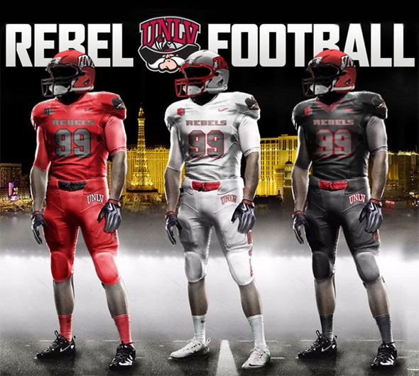
UNLV announced new, Las Vegas-themed, football uniform concepts for its 2015 season.
I, personally, liked the uniforms that were worn between 2009 and 2011 and was disappointed when Bobby Hauck changed them in 2012. The 2009 uniforms were simple and elegant and showcased school pride with the large-print "REBELS" across the chest and large logos on the sleeves and pants. Furthermore, the gray shoulders provided a good contrast against the red of the body of the jersey in the bright Las Vegas sun, and the whole scheme was unique in college football.
There was definitely some room for improvement. Some of the colors could have been tweaked. The helmets were also especially ugly. But overall I liked these uniforms. They were distinctly UNLV's.
The uniforms from 2009-2011 [LEFT] had a distinctive pattern and prominent school logos.
The uniforms in 2012-2014 [RIGHT] could easily be mistaken for Ohio State.
By comparison, the 2012 uniforms looked like hand-me-downs from Ohio State. On their own, the uniforms looked fine with their very retro-classic look, but they just weren't distinctive at all. The "REBELS" print on the chest was minimized, the school logos were removed, and the uniform lacked the school pride that I thought the previous ones showed so well. However, I didn't much care for the 2009 helmets, and I thought that the 2012 helmets were a stark improvement with the stripes and easier-to-read "UNLV" logo. I also liked the Reno variant helmets that included the Freemont Cannon under the logo, even though I hated the all-gray uniform variant itself.
I like that these new 2015 uniforms retain the large-print "REBELS" text of the 2009 ones. The large Hey Reb logo on the shoulders and the UNLV logo on the pants also helps to bring back the sense of displaying school pride that was absent from the 2012 versions.
However, I strongly dislike how monochrome all the uniforms are! I don't know what it is with football's current fascination with monochrome uniforms, but I think they look terrible. These new uniforms could maybe work if the different components were mixed-and-matched. The silver helmet, red jersey, and white pants could look good as a home uniform. And I could maybe see the black pants being worn as an alternate for either home or away uniforms.
The new, red helmet design features a "Welcome to Fabulous Las Vegas" decal on the back.
Speaking of the helmet: it is probably the strongest part of the new uniform. The color contrast between the logo and the helmet shell looks good on both variants. These helmets also seem to have a faint metallic shine that looks a bit better than the washed-out gray of the previous 2012 helmet. I particularly like the return to a red facemask on the silver helmet.
The helmet is also where one of the most prominent new themes is most noticeable. In addition to a sense of school pride being conveyed by the name and logos being prominently displayed, these new uniforms also showcase a pride in the city and its infamously-unique history. Both helmet variations include a decal of the famous "Welcome to Fabulous Las Vegas" sign located on the south end of Las Vegas Boulevard (i.e. "The Strip"). It's a nice touch.
Overall, both helmets look good, and I like the silver one a bit better.
There is also a more traditional, gray / silver helmet design (also with the Las Vegas decal on the back).
The "Las Vegas" theme doesn't end with the helmets though. The pants also have different Las Vegas-themed art on them. The red and the black pants both feature a pattern of stars along the outside of both legs. One star is based on the one in the welcome sign, and the others seem to be based on the sign of the iconic Stardust hotel that was demolished in 2006.
The red and black pants will feature a star pattern along the outside of the leg that is symbolic
of the "Welcome to Fabulous Las Vegas" sign, along with the iconic Stardust casino.
They look fine on the red pants and are easy to see. They don't stand out very well on the black pants, however, due to the predominant gray-on-black theme. In fact, this is a general criticism of the black uniform as a whole: it's too hard to see any detail. The black on gray with dark red trim is all too dark. The numbers and logos are, thus, very hard to see (except for the white and red "UNLV" logo on the pant). Tell me, did you even notice the Hey Reb logo on the black sleeves? I really don't like the black uniform at all. It's also probably going to be very hot and uncomfortable for the players unless all the home games are night games.
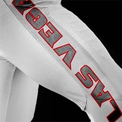
The white pants will have the words "Las Vegas" written along the outside of the leg.
The white pants have a different design than the red and black ones. The words "Las Vegas" are printed in colored, stylized text. I like this design a lot more than the stars. For one thing, the red and gray text stands out much better against the white pant. Personally, I don't see why both patterns couldn't be incorporated into all the pant variants. The words "Las Vegas" could be written along one leg, and the stars can be displayed on the other leg.
Overall, I like the direction that the uniforms are taking. They show both school and civic pride, but I feel that they don't go over-the-top. A Las Vegas-themed uniform could very easily get out of hand and become the laughing stock of the nation. I don't think these uniforms go that far, and so perhaps the simplicity of the uniforms is actually a good thing.
I can't make a final judgement until I see the uniforms under the Las Vegas sun at Sam Boyd this fall. But in the end, I don't care what the uniforms look like. All I want is for the team to win some games.