I don't recall the last time I played an open world sandbox game through to the end credits prior to writing a review for it. Usually, I've made my decision about the game long before credits roll. If I like the game, I usually stop before it becomes too tedious, finish up my review, move on to something else, and I rarely ever go back to finish these games. That was the case with Assassin's Creed: Black Flag, Shadow of Mordor, and others. Ghost of Tsushima is a rare instance of me actually liking an open world sandbox game enough that I couldn't stop playing.
One of the sad ironies for me, as an amateur critic, is that I usually play a game longer if I don't like it -- sometimes all the way to end credits. As was the case with Assassin's Creed III and Shadow of War. This is because I want to find out if there's anything late in the game that might redeem it -- even if in some small way.
In this regard, Ghost of Tsushima is a rare exception. I was enjoying the heck out of the game and wanted to see how it ends before I commit to a review. It wasn't even a case of me rushing through the main story just to get it over with (as is the case with many bad open world games). In fact, I completed all the side missions (including the mythic missions), liberated a majority of the occupied towns, and found a majority of all collectibles. I might even play some of the epilogue. So I can say without reservation that I like this game! And it all begins with the presentation.
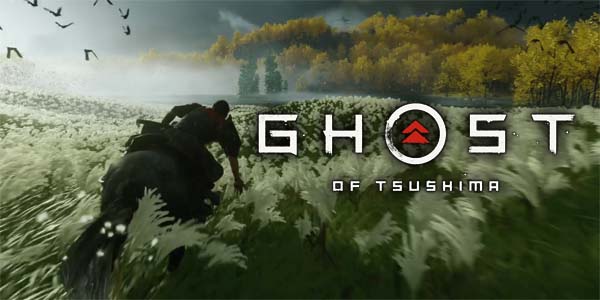
This is not a promotional still! Nor was it taken with the included "photo mode".
This is just what the game looks like!
You have to see it to believe it
Ghost of Tsushima is not necessarily the most technically impressive game that I've played. Games like Red Dead Redemption II and The Last of Us Part II have had better facial animation, lighting, textures, and/or draw distance. But where Tsushima lacks in technical capabilities, it more than makes up for in aesthetics and artistry. The environments are beautiful, and the weather effects (especially wind effects) are second to none. Whether it's fields of vividly-colored flowers swaying in the wind, or ocean waves crashing on a sandy beach, or the plum trees on a rocky mountain dropping their blossoms into the breeze, or a thunderstorm threatening over the horizon, or a shinto temple towering over a forest of golden trees, there is something pretty to look at no matter where you go.
Screenshots do not do the game justice. You have to see it in HD motion to appreciate it.
I'm not normally one to gush over a game's graphics, but Ghost of Tsushima really stands out for its environmental design. Over the crest of every hill, it seemed a majestic screenshot opportunity awaited me. Picking just one or two to highlight in this review was a real challenge. Even the best screenshots that I could capture do not do the game justice. You really have to see it in high-definition motion (without the compression of an internet stream) to truly appreciate it.
I haven't seen weather effects this good since [maybe] The Witcher III.
This game is perfect as a virtual vacation during the travel-restricted social-distancing of the COVID-19 pandemic. Or at least, it would be, if not for the densely-packed sandbox content making it so that I can't take 10 steps without running into an ambient encounter of some kind. I could be trotting along on my horse through a forest lit with the golden glow of a sunset beaming through the canopy, with the serene ambiance of the wind harmonizing with the background music of Japanese flutes. But I can't enjoy this serenity for more than 5 seconds before a pack of Mongols shows up, the flutes give way to battle drums, and it's back to the swinging of swords and showers of blood. [More]
d31e1ee5-04a3-49c4-b00e-3fb75f7ae502|1|5.0
Tags:Ghost of Tsushima, Sony, PlayStation, PS4, Sucker Punch, Japan, samurai, Mongols, Shinto, spiritualism, fox, open world, sandbox
I think the last few years have brought us to a bit of an inflection point for open world video games -- which I feel have been in kind of a rut for the better part of the last decade. Long-time readers of my personal blog will probably be very familiar with my complaints. The two core complaints that I've had with this particular game design paradigm are:
- That the map itself rarely feels meaningful as a game space, and instead serves primarily as a convoluted mission-select screen full of time-wasting filler content.
- That the sandboxy nature of the game design means that the world and narrative often feel stagnant (as if in a kind of "limbo").
This blog is mostly a transcript of a YouTube video that I posted.
These problems can be traced back at least to 2001's Grand Theft Auto III, which set many of the conventions of open world games for the next two decades. Companies from Ubisoft to Bethesda, and many others, would copy GTAIII's structure of going to a location on the map to trigger a mission in an aggressively linear, cinematic story, while spending free time on time-wasting filler content that did nothing to move the story forward.
Grand Theft Auto III set many of the standards
for open world games over the past 20 years.
Aside from Ubisoft's Assassin's Creed and Far Cry series, these problems have been present to varying degrees in everything from Skyrim to The Saboteur to Mad Max to Just Cause to The Amazing Spider-Man to Fallout 4 to Metal Gear Solid V, and many more. It started getting to the point that when I would see a game advertise the size of its map, I'd roll my eyes and lose interest. "Great, that's just more wasting my time walking from place to place with nothing meaningful or interesting or challenging to do."
Where you are on the map, where you're going, and how you get there was almost completely irrelevant in these games, which made the map itself (no matter how big and scenic it might be) feel mostly irrelevant. In fact, some games started introducing mechanics that let you bypass the map entirely by letting you fly, glide, or zipline to points of interest without having to engage with the space in between. In the case of Metal Gear Solid V's Afghanistan map, the roads are lined with sheer cliffs, funneling the player along linear paths from enemy outpost to enemy outpost, with practically nothing for you to do in the space between outposts. Even though the stealth action at those outposts was some of the best in the series, I couldn't help but think that Snake Eater provided a much more fulfilling experience of living within an open-ended game world.
I would roll my eyes whenever a game advertised the size of its map or hours of content.
The maps themselves weren't playspaces anymore; they were just the spaces in between towns, dungeons, and set pieces where the actual gameplay would take place. Just point in the direction of a waypoint and walk in a straight line, stopping every minute or so to pick up an umpteenth collectible, or climb an umpteenth tower, or sneak into an umpteenth enemy base and kill the umpteenth recycled mini-boss. Stop me if you've done all this before... A majority of the time with the game was just travelling around the map without any engagement in any gameplay systems or mechanics or strategies, and then playing some rote, recycled filler content to pass the time. And as the maps got bigger and bigger, the filler content just kept multiplying.
...
[More]
abf2cb68-ef06-4e1e-aa8a-4f1527dce74f|1|5.0
Tags:open world, sandbox, game design, map, traversal, obstacle, travel, exploration, cartography, geography, narrative, ludonarrative, Ubisoft, Bethesda, Assassin's Creed, Assassin's Creed IV: Black Flag, Final Fantasy XV, The Legend of Zelda: Breath of the Wild, Red Dead Redemption 2, Marvel's Spider-Man, Firewatch, Miasmata, Sunset Overdrive, Death Stranding, Shadow of the Colossus, Resident Evil
Once again, Rockstar is absolutely abysmal when it comes to its tutorials. It gets the very first one right, by displaying the prompts on the bottom center of the screen, below the subtitles. That's for the basic movement controls that should be common sense. Once it gets into the more complicated and esoteric stuff that isn't intuitively obvious, it falls back on the tried-and-failed method utilized in Grand Theft Auto V of printing a tutorial prompt in a tiny black box in the top corner of the screen, during the action of the game!
Even if you are lucky enough to notice that there's a tutorial tip while you're in the middle of a horse chase or shootout, it's still hard to read and decipher the tiny text and button icons. There's no option to use a larger font or to rescale the UI if you're playing on a less-than-huge TV. Rockstar, listen, I'm playing the game on a console, from my couch, with a wireless controller, ten or so feet away from a 46-inch TV. I'm not 14 inches from the screen. Use a readable font!
Tutorial prompts appear in tiny, hard-to-read black boxes in the corner of the screen,
often in the middle of an action sequence, in which your attention is on something else.
We did buy a much larger TV over Black Friday, so the UI is now much easier to read, and my girlfriend might even go back and play games like Monster Hunter: World and Assassin's Creed: Origins now that the TV is big enough to read the damned text on the screen.
It doesn't help that there is no way in-game to review any of the tutorial prompts that you may have missed, nor is there any way to view the controller mapping. There's a "Help" section in the pause menu that does contain a large amount of information, but that only helps if you know what you're looking for. If you couldn't read the tutorial prompt because you were busy in a gunfight or horse chase or whatever, then you're not going to know what you're even supposed to be looking for if you try to look it up. It's like opening up a dictionary, but not knowing what word you're trying to define. The controls for this game are very complicated, with lots of buttons being overloaded to multiple, context-sensitive commands, and with certain commands requiring that you hold multiple buttons. I'm constantly forgetting the controls for fist-fights, and I can never remember the dive/roll button for the life of me. It would be very nice to be able to pause the game and double-check the controls if you're coming back to the game after having not played for a few weeks or months, or if you come across a mechanic that hasn't been tutorialized or practiced yet.
It's hard to make out what many of these icons are supposed to represent.
This is further exacerbated by the use of tiny icons that are still hard to decipher on the 75-inch TV -- and were impossible to read on the 46-incher. Seriously, if you're playing on anything less than a 60-inch TV, you need hawk eyes to be able to read this stuff! Often, I would see one of the horse icons above my mini-map flash red with some un-discernible icon, and I had no idea what this icon meant. It was over the horse's health icon, and kind of looked like it might be a steak, so I tried feeding the horse, which did nothing. Besides, why would Rockstar use a steak icon to indicate that you need to feed a horse? Horses don't eat steak. After some digging online, I discovered that this icon maybe means that my horse is dirty, and I need to brush her or run her through water to clean her.
Similarly, in base camp, there are three icons in the top right corner that are tiny and un-discernible. They are supposed to represent the camps supplies: food, medicine, and ammunition (I think), but damn if I could tell which one is which. The glut of articles and forum topics explaining just what these icons mean tells me that I'm not the only one who had this problem.
Living in the game world
Once you get through the tutorials and start playing the game proper, you'll be rewarded with a massive, immaculately-detailed, and well-realized world that feels like a living, breathing place. Unlike many other open world games and RPGs, Red Dead Redemption 2's simulationist design truly provides a feeling of living within this world. There's a bevy of context-sensitive animations that make everything feel so organic and life-like, and which really help to immerse the player in this gritty, realistic setting.
The game world is immaculately constructed and detailed.
I've seen plenty of complaints about these time-consuming, laborious animations on the internet, and at first, I thought that I was going to loathe having my time wasted. I was all ready to draft up a review complaining about Rockstar being arrogant and over-indulgent. But as I played the game more, I have to say that I came to love them... [More]
Dang. I was really hoping to have this out before the end of the year...
Shadow of Mordor was easily one of my favorite games of 2015, and one of my best reviewed games of that year, and I even cited it as an example of successful open world game mechanics. I've praised the game for its tightly-focused design, relatively limited scale, and the fact that it didn't waste the player's time with an excess of meaningless collectible hunts.
"The developers showed plenty of restraint in many areas of design so that they could focus on the innovative new feature that everything in the game revolves around. The design is tight and streamlined. They didn't waste the player's time with an excessively large, complicated map, or a multitude of irrelevant mini-games and side quests."
- from my Middle-Earth: Shadow of Mordor review
Yes, the original game did have some collectible hunts. It did have some filler content. It did have bullshit, game-y missions with arbitrary win/loss conditions. But those issues weren't pervasive enough to bring down the game as a whole, and the game generally flowed very smoothly. In their quest to mindlessly monetize the sequel, Shadow of War, Warner Brothers and Monolith have doubled down on both the best elements and the worst elements of Shadow of Mordor, and the result is beautiful when it works, and ugly when it doesn't.
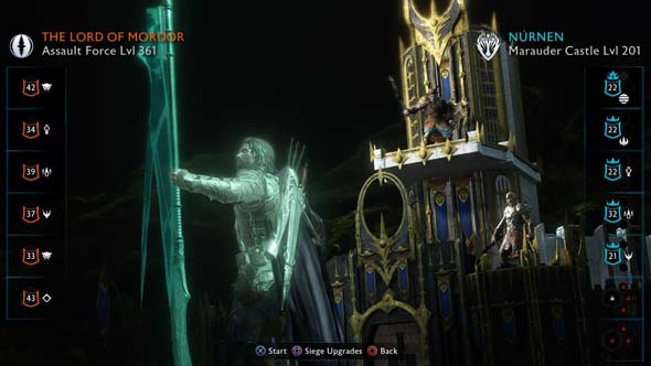
You now recruit orc captains to defend fortresses from Sauron's army.
The biggest problem is that the game now feels like a grind. In order to get you to pay for in-game, randomized micro-transactions called "War Chests", the campaign has been needlessly padded-out. Instead of having the option to hunt down uruk captains for the utilitarian purposes of gaining intel or gathering an army of mind-controlled slaves to do your bidding, you now must recruit orc captains into your own army in order to siege and then defend castles and fortresses from Sauron's counter-invasion. In principle, this sounds like a brilliant idea! I've often criticized open world and sandbox games for not having actual threats or consequences that pressure the player into acting. In fact, requiring that the player defend and hold captured strongholds from enemy counter-attacks is exactly the sort of thing that I've proposed as a compelling way to keep the game world feeling alive, and to keep the villain actually feeling threatening and antagonistic.
The problem is that (aside from one scripted castle defense) all the castle defending is back-loaded into the final act of the game. At this point, the plot is basically over, ... [More]
ae89c159-d700-491f-810c-2ed2093b5137|0|.0
Tags:Middle Earth: Shadow of War, Middle Earth: Shadow of Mordor, the Lord of the Rings, Monolith Productions, Warner Brothers Interactive Entertainment, J.R.R. Tolkien, Talion, Celebrimbor, orc, undead, wraith, elf, Middle Earth, Sauron, Shelob, Brûz The Chopper, action, open world, sandbox, parkour, RPG, micro-transaction, war chest, loot box, eBay
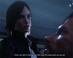
Okay, I said I would give up on Shinji Mikami after the first Evil Within game, but here I am giving that IP a second chance. I had heard that the expansions for Evil Within were actually pretty good, and that they even made the base game better by filling in some of the narrative gaps. But I was so furious with the base game that I sure as hell was not going to shell out more money for DLCs. If they were that integral to the core game, then they should have been included with the core game. Now that my furor over the original has faded a bit, I was hearing that the sequel is also much better than the original game and leans more heavily in the horror camp than the action shooter camp. I was dismissive of the game's announcement, and I was skeptical of the claims that the sequel was actually good, so I picked up a [relatively] cheap used copy off eBay so that I could give it a chance over the Halloween week without necessarily giving any more money to Bethesda.
I feel like I missed something...
Maybe I should've played the DLC?
Besides, Shinji Mikami isn't the director this time around. Instead the sequel is directed by John Johanas, who was the director of the [supposedly] good DLC expansion packs. The first game actually did have some good ideas and set pieces within, so maybe a different directorial approach could bring those ideas out to their full potential?
A more focused package
To Johanas' credit, the game, as a whole, definitely has a more "unified" presentation. The first game felt very scattershot with regard to how it wanted the player to play. It's early chapters (which were also the most enjoyable parts of the game) were focused mostly on stealth, with a few pursuit and escape moments thrown in. It was slow, somewhat atmospheric, and built incredible tension. But those mechanics were quickly dropped in favor of shooting gallery set pieces, constant scripted ambushes, set piece boss encounters, and frantic, funhouse-ish trap / puzzle rooms. The sequel, thankfully, is much more focused. I didn't feel like I was wasting my resources by putting points into Sebastian's stealth skills (a skill tree that was completely absent from the previous game), as you can actually continue to use them over the course of the entire game. Sure, there's still scripted ambushes and puzzle rooms, but the focus is much more firmly planted in sneaking around, exploring the environments, and generally avoiding detection.
Unfortunately, there's still a bit too much of a focus on frenzied action. It detracts significantly from any sort of horror or tension that the game might be trying to build up. The autosaves are fairly generous (even though there are also manual save points in each of the game's safe houses), so enemies come in hordes, hit very hard, and deaths are going to happen. Chapter 3 basically completely desensitized me to death and put me in the habit of just standing up and letting the monsters kill me if I ever screwed up the stealth.
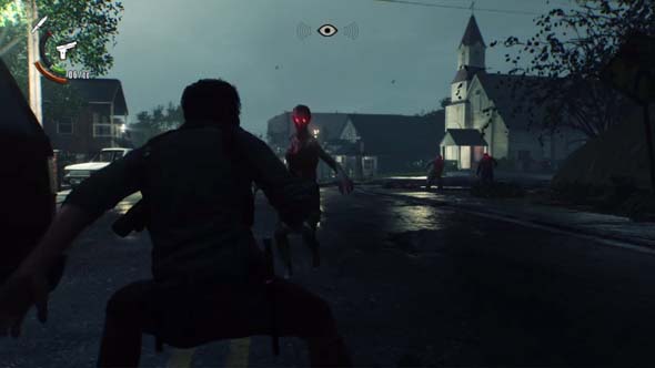
The early combat encounters are not gentle, as they put you up against hordes of enemies.
There's a greater focus on open-ended exploration this time around, and Chapter 3 is the first open map that the player is free to explore. There's basically two main paths through it: the hard one and the easy one. The easy path is basically a straight line due north from where you start, but the game throws some curveball objectives at you that basically encourage you to try the other paths that end up being much harder. You're told about weapon caches and NPCs that you're supposed to try to save. One such weapon is the crossbow, which is actually a pretty necessary tool (because, you know, every game has to have a crossbow). It's right off to the side of where you start, but picking it up can easily lead you down a much harder path to your actual mission objective... [More]
a80e28ec-25a4-48ed-8bdc-50264cab70ac|1|4.0
Tags:The Evil Within, The Evil Within 2, Bethesda, Tango Gameworks, survival horror, horror, action, shooter, open world, sandbox, stealth, zombies, mental institution, virtual reality, psychopath, Sebastian Castellanos, eBay, John Johanas, Shinji Mikami, Resident Evil, Silent Hill
|

| 12 | | | | | | | 60 | | 11 | | | | | | | 55 | | 10 | | | | | | | 50 | | 09 | | | | | | | 45 | | 08 | | | | | | | 40 | | 07 | | | | | | | 35 | | 06 | | | | | | | 30 | | 05 | | | | | | | 25 | | 04 | | | | | | | 20 | | 03 | | | | | | | 15 | | 02 | | | | | | | 10 | | 01 | | | | | | | 05 |
|